
- 분류 전체보기 (662)

- PROGRAMMING (433)
- JAVA (11)
- JAVA SPRING (13)
- PYTHON (0)
- JAVASCRIPT (21)
- React (70)
- HTML (0)
- Next.JS (1)
- CSS (2)
- DB (Oracle, MongoDB, etc.) (1)
- 깃허브 (31)
- 백엔드 (2)
- 프로젝트 (24)
- 슈퍼코딩 강의 정리 (125)
- ERROR (5)
- 단축키 기타 (1)
- 리눅스 (2)
- LEETCODE (1)
- 정보처리기사 (1)
- 프로그래밍 영어 (2)
- 코테 (5)
- 면접준비 (33)
- 웹사이트 아이디어 비공개 (1)
- 정보처리기사(기본 CS 정보정리) (0)
- 백준 (1)
- 기타 (56)
- 도서 내용 정리 (21)
- 삽질로그 (2)
- PREPLY (1)
- TRAVEL (0)
- DIARY (4)
- OVERSEAS SALES (143)
- PERSONAL (1)
- PROGRAMMING (433)
| 일 | 월 | 화 | 수 | 목 | 금 | 토 |
|---|---|---|---|---|---|---|
| 1 | ||||||
| 2 | 3 | 4 | 5 | 6 | 7 | 8 |
| 9 | 10 | 11 | 12 | 13 | 14 | 15 |
| 16 | 17 | 18 | 19 | 20 | 21 | 22 |
| 23 | 24 | 25 | 26 | 27 | 28 |
- MERN스택
- 미니마카
- 나일론지퍼
- 영어시간읽기
- 자켓실측
- 봉제용어
- 엑셀필터복사붙여넣기
- 우레탄지퍼
- 40HQ컨테이너40GP컨테이너차이
- 슈퍼코딩
- 엑셀드래그단축키
- AATCC
- 지연환가료
- 암홀트롭
- 고급영어단어
- 웹API
- 비슬론지퍼
- TACKING
- 핸드캐리쿠리어차이점
- 비리짐
- 요척합의
- 미국영어연음
- WHATTIMEOFTHEDAY
- 필터링후복사붙여넣기
- Armhole Drop
- 클린코드
- 엑셀자동서식
- 와끼
- 40HQ컨테이너
- 헤이큐
- Today
- Total
CASSIE'S BLOG
The Odin Project 본문
Introduction
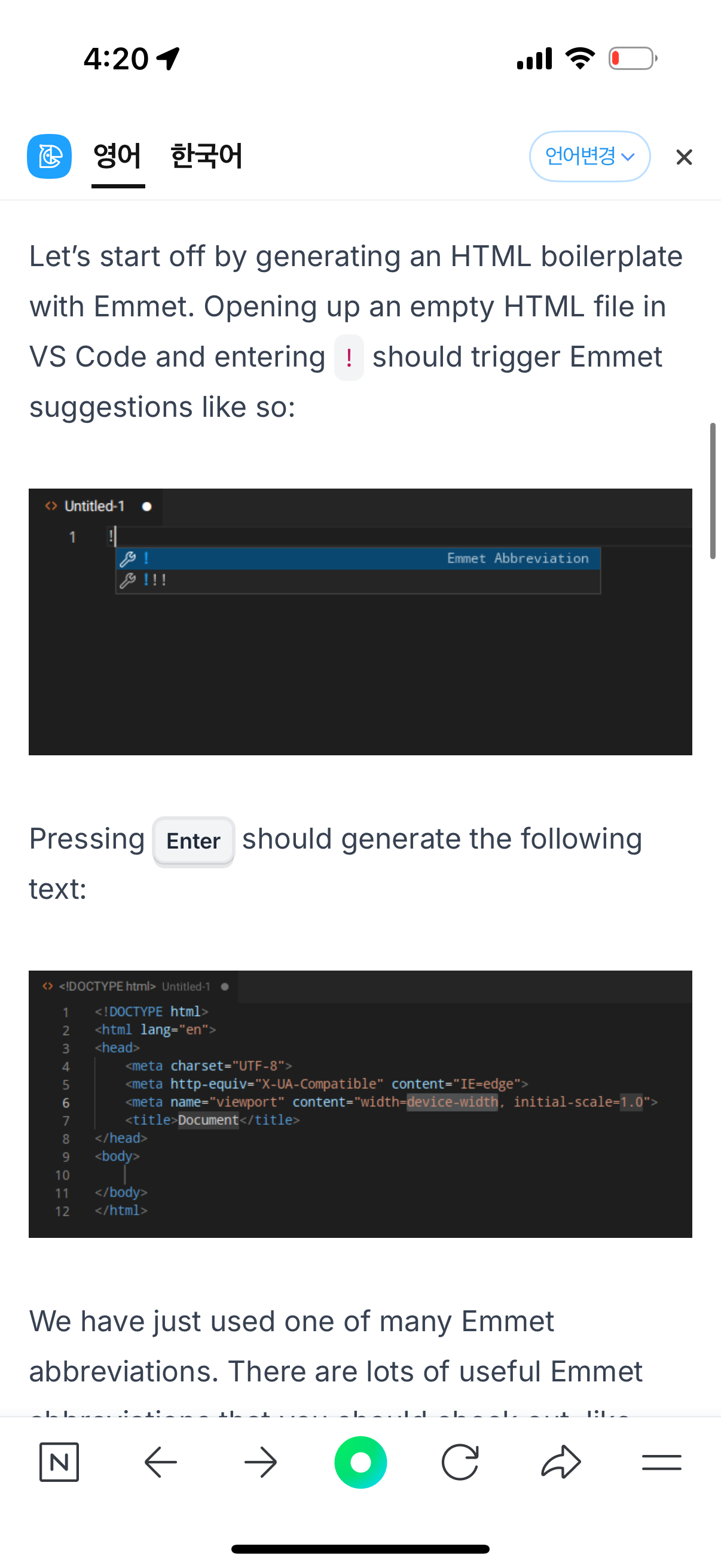
Emmet is a plugin, built into VS Code, that helps you write HTML and CSS more efficiently by providing a bunch of clever shortcuts. By now, you have written a good amount of HTML and CSS, and if you have been using VS Code there’s a big chance that you have already encountered Emmet in some way.
Rem을 많이 쓴다.
Advanced Selector
Child and sibling combinators
Let’s have a look at some more ways we can access different elements without referring to their classes. Here are three new selectors to do just that.
> - the child combinator
+ - the adjacent sibling combinator
~ - the general sibling combinator
We’ll tackle some practical examples using this sample markup.
<main class="parent">
  <div class="child group1">
    <div class="grand-child group1"></div>
  </div>
  <div class="child group2">
    <div class="grand-child group2"></div>
  </div>
  <div class="child group3">
    <div class="grand-child group3"></div>
  </div>
</main>
By now, you should be pretty comfortable writing rules using the descendant combinator you learned about in Intro to CSS. For instance, if we wanted to select all the child and grand-child divs inside of main, we could write:
main div {
/* Our cool CSS */
}
But what if we wanted to be more specific and select only the child or grand-child divs? That’s where the child combinator > comes in handy. Unlike the descendant combinator, it will only select direct children.
/* The divs with the class "child" will get selected by this */
main > div {
/* Our cool CSS */
}
/* The divs with the class "grand-child" will get selected by this */
main > div > div {
/* More cool CSS */
}
Phrased another way, the child selector will select an element that is one level of indentation down. In order to select an element that is adjacent (immediately following) to our target, or on the same level of indentation, we can use the adjacent sibling combinator +.
/* Only the div with the classes "child group2" will get selected by this */
.group1 + div {
/* Our cool CSS */
}
/* Only the div with the classes "child group3" will get selected by this */
.group1 + div + div {
/* More cool CSS */
}
Finally, if we want to select all of the siblings following an element and not just the first one, we can use the general sibling combinator ~.
/* All of .group1's div siblings - in this case the 2nd and 3rd .child divs, will get selected by this */
.group1 ~ div {
/* Our cool CSS */
}
More CSS Properties
CSS Functions
Lesson overview
This section contains a general overview of topics that you will learn in this lesson.
Recognize the basic parts of a CSS function.
Learn about the calc(), min(), max(), and clamp() functions and how to use each one.
이 부분은 calc() 함수가 CSS에서 동적 계산을 할 때 유용하다는 것을 설명하고 있습니다. **calc()**는 여러 단위가 혼합된 값들을 계산할 수 있게 해주는 CSS 함수입니다. 예를 들어, px, em, rem, %, vh 등의 단위를 혼합해서 사용할 때 유용합니다.
calc() 함수 사용 예시:
1. 동적 크기 조정:
.container {
height: calc(100vh - 50px); /* 100% 뷰포트 높이에서 50px만큼 빼는 계산 */
}
2. 미디어 쿼리에서 레이아웃 크기 조정:
.main-content {
width: calc(100% - 2rem); /* 100% 너비에서 2rem을 뺀 크기 */
}
3. CSS 변수와 결합하여 더 복잡한 계산 처리:
:root {
--header-height: 50px;
--footer-height: 30px;
}
.content {
height: calc(100vh - var(--header-height) - var(--footer-height));
}
calc()가 유용한 이유:
• 여러 단위가 섞여 있을 때, CSS로 동적인 계산을 할 수 있게 도와줍니다.
• **뷰포트 단위 (vh, vw)**와 **픽셀 단위 (px)**를 혼합하여 크기를 동적으로 설정할 수 있습니다.
• calc()를 사용하면 고정된 값 대신 상대적인 계산을 사용할 수 있기 때문에, 반응형 디자인에 유용합니다.
예시 설명:
• 예를 들어, main = 100vh - (header + footer)라고 할 때, calc()를 사용하면 100vh에서 header와 footer의 크기만큼 빼는 계산을 CSS에서 바로 할 수 있습니다. 이 방법은 화면 크기에 따라 자동으로 크기가 조정되므로, 더 효율적이고 유연한 레이아웃을 만들 수 있습니다.
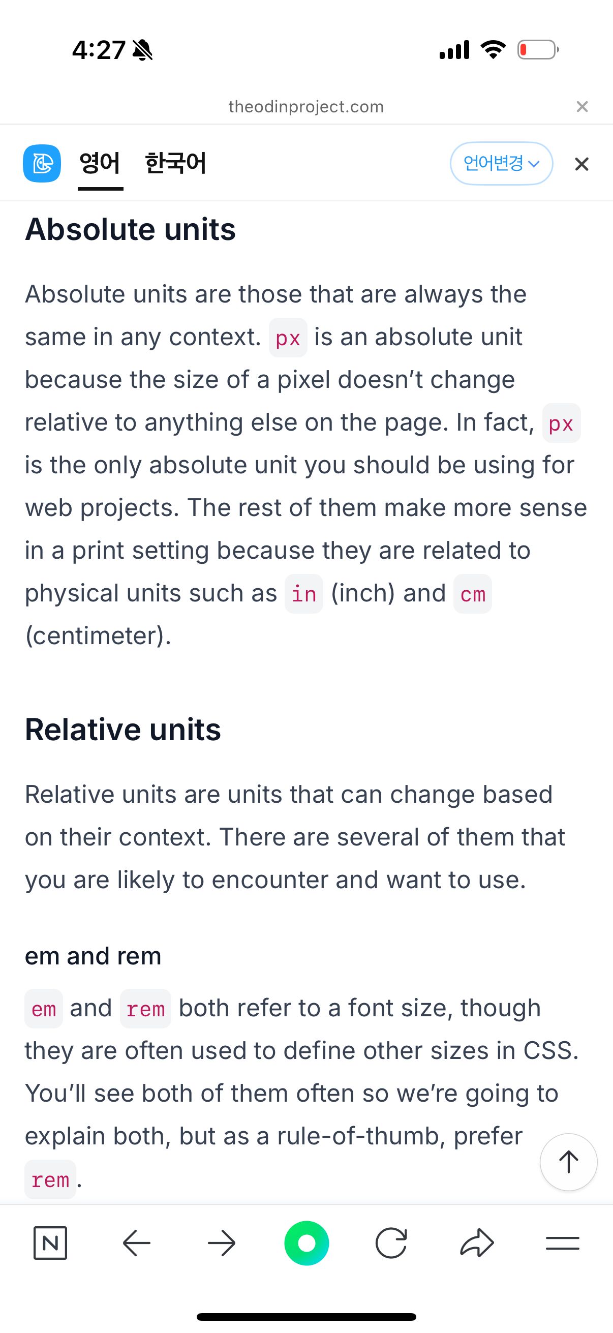
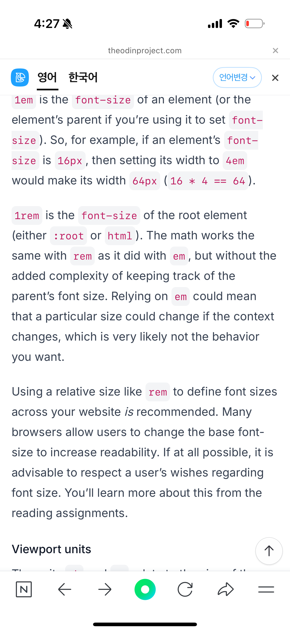
맞습니다! 2rem이 몇 픽셀인지 알기 위해서는 기본 폰트 크기를 알아야 합니다.
rem 단위는 루트 요소 (<html> 요소)의 폰트 크기를 기준으로 합니다. 보통 브라우저의 기본 폰트 크기는 16px입니다.
따라서, 2rem은 기본 폰트 크기의 2배가 되며, 기본 폰트 크기가 16px일 경우 2rem은 32px입니다.
그러나, 만약 루트 요소의 폰트 크기가 변경되었다면, rem의 값은 그에 맞춰 계산됩니다. 예를 들어, html { font-size: 18px; }로 설정하면 1rem은 18px이 되고, 2rem은 36px이 됩니다.
예시:
• 기본 폰트 크기 16px일 경우: 2rem = 32px
• 기본 폰트 크기 18px일 경우: 2rem = 36px
따라서, calc(100% - 2rem)에서 2rem이 몇 픽셀인지는 루트 요소의 폰트 크기에 따라 다르기 때문에, 이를 정확히 알기 위해서는 그 값을 확인해야 합니다.
min() 함수는 CSS에서 여러 값 중에서 가장 작은 값을 선택하는 기능을 합니다. 이 함수는 두 개 이상의 값을 받아들이고, 그 중에서 가장 작은 값을 선택하여 해당 스타일에 적용합니다.
min() 함수 사용 예시:
width: min(150px, 100%);
위 예시에서 min(150px, 100%)는 두 값 중 작은 값을 선택합니다:
• 만약 부모 요소의 너비가 150px 이상이라면, 150px가 선택되어 이미지의 너비가 150px로 설정됩니다.
• 만약 부모 요소의 너비가 150px보다 작다면, 100%가 선택되어 이미지의 너비가 부모 요소의 너비에 맞춰 100%가 됩니다.
min() 함수의 기능:
• 여러 값 중에서 가장 작은 값을 선택합니다.
• 이 값을 기본 수학 연산과 결합하여 더 복잡한 계산을 할 수 있습니다. 예를 들어:
width: min(80ch, 100vw - 2rem);
여기서 80ch는 80개의 문자 폭을 의미하고, 100vw - 2rem은 전체 뷰포트 너비에서 2rem을 뺀 값입니다. min()은 이 두 값 중에서 더 작은 값을 선택하여 적용합니다.
주요 특징:
• min()은 최대값을 제한하는 데 사용될 수 있습니다. 예를 들어, 너비가 일정 값을 초과하지 않도록 제한하려면 min()을 사용합니다.
• 반응형 디자인에서 유용하게 사용됩니다. 부모 요소의 크기에 따라 동적으로 크기를 조절하면서도 최대값을 설정할 수 있기 때문에, 레이아웃이 깨지지 않도록 보호할 수 있습니다.
Focus on this line width: min(150px, 100%); we can make several observations: If there are 150px available to the image, it will take up all 150px. If there are not 150px available, the image will switch to 100% of the parent’s width. In the first case min() selects 150px, since 150px is the smaller (the minimum) between 150px and 100% of the parent’s width; in the second, it chooses 100%. min() behaves as a boundary for the maximum allowed value, which in this example is 150px.
You are able to do basic math inside a min ( ) => for example: width: min(80ch, 100vw - 2rem);
https://www.theodinproject.com/lessons/node-path-intermediate-html-and-css-css-functions
CSS Functions | The Odin Project
You may have noticed that some property values you’ve worked with in CSS have a slightly different syntax. When the value is a word followed by a pair of parentheses () containing information between them - as in background-color: rgb(0, 0, 0) - you’re
www.theodinproject.com
max()
Max works the same way as min, only in reverse. It will select the largest possible value from within the parentheses. You can think of max() as ensuring a minimum allowed value for a property.
Consider the following property of a given element:
width: max(100px, 4em, 50%);
From this list of given sizes, max() will select the largest one. As long as 4em or 50% result in lengths longer than 100px, max() will select (the bigger) one of them. If they are smaller than 100px (maybe as a cause of user’s font size preferences, or their browser’s window size or zoom level), then 100px will win out as the largest. You can think of 100px in this example as a guard value: width here won’t ever be set to less than 100px.
The max function is most useful when the viewing window is either exceptionally small, or the user increases the content size by using the browser’s zoom feature. You may not find a lot of use for max at first, but it is a good tool to be aware of for projects where accessibility is important.
max()는 min()과 비슷하게 작동하지만 반대로, 괄호 안에 주어진 값 중에서 가장 큰 값을 선택합니다. max()를 사용하면 최소 허용 값을 설정하는 방식으로 생각할 수 있습니다.
예시:
width: max(100px, 4em, 50%);
이 예시에서 max()는 주어진 값 중에서 가장 큰 값을 선택합니다. 즉, 100px, 4em, 50% 중에서 가장 큰 값이 선택됩니다. 만약 4em 또는 50%가 100px보다 더 긴 값이라면, max()는 그 중 더 큰 값을 선택합니다. 반대로, 4em 또는 50%가 100px보다 작다면, 100px가 선택됩니다. 이 경우 100px는 최소 한계값을 설정하는 역할을 합니다.
요약:
• max()는 최대값을 제한하는 데 사용됩니다.
• 예를 들어, width가 100px보다 작아지지 않도록 보장합니다.
• 반응형 디자인이나 접근성을 고려할 때 유용합니다. 예를 들어, 사용자들이 브라우저의 확대/축소 기능을 사용하거나 매우 작은 화면에서 보더라도, max()를 사용하면 요소의 크기가 너무 작아지지 않도록 할 수 있습니다.
따라서 max()는 처음에는 많이 사용되지 않을 수 있지만, 접근성이나 특정 크기 이하로 작아지지 않도록 보장하고자 할 때 매우 유용한 도구입니다.
clamp() 함수는 CSS에서 유동적이고 반응형 디자인을 구현할 때 유용하게 사용됩니다. clamp()는 세 가지 값을 받으며, 주어진 최소값, 선호값, 최대값을 기준으로 요소의 크기를 자동으로 조절합니다.
clamp() 함수의 문법:
property: clamp(minimum, preferred, maximum);
• minimum: 값이 이보다 작아지지 않도록 보장하는 최소값.
• preferred: 선호하는 값으로, 일반적으로 동적하게 조정되는 값입니다. 보통 상대적인 값이나 계산된 값이 들어갑니다.
• maximum: 값이 이보다 커지지 않도록 보장하는 최대값.
작동 원리:
clamp()는 선호값을 기준으로, 주어진 최소값과 최대값 사이에서 동적으로 조정됩니다. 만약 선호값이 최소값보다 작으면 최소값이 적용되고, 최대값보다 크면 최대값이 적용됩니다. 그렇지 않으면 선호값이 그대로 적용됩니다.
예시:
font-size: clamp(14px, 5vw, 24px);
• minimum: 14px (폰트 크기가 14px보다 작아지지 않도록)
• preferred: 5vw (뷰포트 너비의 5%로 폰트 크기가 동적으로 조정됨)
• maximum: 24px (폰트 크기가 24px보다 커지지 않도록)
작동 방식:
• 화면 크기가 커지면 5vw (5%의 뷰포트 너비)가 커지기 때문에 폰트 크기도 커집니다.
• 그러나 폰트 크기는 최소 14px 이상, 최대 24px 이하로 제한됩니다. 즉, 5vw가 14px보다 작거나 24px보다 크지 않도록 clamp()가 조절해 줍니다.
사용 예시:
1. 반응형 폰트 크기 설정:
font-size: clamp(16px, 4vw, 32px);
• 화면 크기가 줄어들면 폰트 크기도 줄어들고, 커지면 폰트 크기도 커지지만, 16px과 32px 사이에서만 변동합니다.
2. 반응형 요소 크기 조정:
width: clamp(200px, 50%, 500px);
• 요소의 너비는 최소 200px, 최대 500px까지, 그 사이에서 50%의 부모 너비에 맞춰 조정됩니다.
장점:
• 유동적이고 반응형으로 요소의 크기를 자동 조정할 수 있습니다.
• 최소값과 최대값을 설정해 레이아웃을 깨지지 않게 보장할 수 있습니다.
• 뷰포트 크기나 화면 크기 변화에 따라 자동으로 크기가 조정되므로 디자인의 유연성을 높일 수 있습니다.
따라서 clamp()는 다양한 화면 크기에서 요소의 크기를 적절하게 조정하면서도, 너무 작거나 커지지 않도록 제어할 수 있는 매우 유용한 도구입니다.
Browser Compatibility
https://www.theodinproject.com/lessons/node-path-intermediate-html-and-css-browser-compatibility
Introduction to Grid
Flex-wrap
flex-wrap은 Flexbox 레이아웃에서 사용되는 속성으로, Flex 컨테이너의 아이템들이 한 줄에 모두 들어가지 않으면 자동으로 다음 줄로 넘겨줄 수 있게 해줍니다. 기본적으로 Flexbox는 아이템들을 한 줄에 배치하려고 시도하는데, flex-wrap을 사용하면 공간이 부족할 경우 아이템들이 여러 줄로 배치될 수 있습니다.
flex-wrap 속성에는 세 가지 값이 있습니다:
1. nowrap (기본값): 아이템들이 한 줄에 모두 배치되며, 넘칠 경우 아이템들이 축소되거나 컨테이너를 넘칩니다.
2. wrap: 아이템들이 한 줄에 모두 배치되지 않으면, 넘친 아이템들이 다음 줄로 감싸집니다.
3. wrap-reverse: 아이템들이 한 줄에 모두 배치되지 않으면, 넘친 아이템들이 다음 줄로 감싸지지만, 순서는 반대로 배치됩니다.
예를 들어, flex-wrap: wrap을 사용하면, 화면 크기에 따라 아이템들이 자동으로 다음 줄로 넘어가면서 배치됩니다.
그리드는 2차원 레이아웃에서 아이템을 쉽게 배치할 수 있다는 점에서 자주 칭찬받습니다.
하지만 그리드는 1차원 레이아웃에도 사용할 수 있습니다. 개발자에게 유리한 점은 처음에 아이템을 한 줄로 시작하더라도 나중에 추가적인 행을 추가할 수 있다는 것입니다.
grid-template은 CSS Grid에서 그리드의 행과 열의 크기, 그리고 그리드에 대한 구조를 정의하는 속성입니다. 이 속성을 사용하여 그리드의 레이아웃을 설정할 수 있습니다. 주로 grid-template-rows와 grid-template-columns와 같은 속성과 함께 사용되며, 그리드의 행(row)과 열(column)의 크기를 설정합니다.
예를 들어, grid-template을 사용하여 3x3 그리드를 정의하는 방법은 다음과 같습니다:
.container {
display: grid;
grid-template-rows: 100px 100px 100px; /* 100px 높이의 3개의 행 정의 */
grid-template-columns: 100px 100px 100px; /* 100px 너비의 3개의 열 정의 */
}
여기서:
• grid-template-rows: 그리드의 각 행의 높이를 정의합니다.
• grid-template-columns: 그리드의 각 열의 너비를 정의합니다.
즉, grid-template은 그리드의 기본적인 레이아웃 구조를 설정하는 중요한 속성으로, 각 행과 열의 크기를 지정해주고, 이를 기반으로 아이템을 배치할 수 있게 해줍니다.
Javascript Course
Rendering Techniques
Rendering a list of components in JSX
We will use props here, and you will learn more about them in a future lesson. For now, you just need to know that props are arguments that are passed into components. We will just be writing a short implementation.
function ListItem(props) {
return <li>{props.animal}</li>
}
function List(props) {
return (
<ul>
{props.animals.map((animal) => {
return <ListItem key={animal} animal={animal} />;
})}
</ul>
);
}
function App() {
const animals = ["Lion", "Cow", "Snake", "Lizard"];
return (
<div>
<h1>Animals: </h1>
<List animals={animals} />
</div>
);
}
We have moved our <ul> element to a different component called <List />. It still returns the <ul> element, but we can do a lot more with it as a component.
This component accepts a props which is an object containing the animals that we defined as a property when we wrote <List animals={animals} />. Do note that you can name it anything, for example, <List animalList={animals} />. You will still need to pass the animals to the property, but now you will use props.animalList instead of props.animals.
We have also created a different component for the <li> element called <ListItem />, which also accepts props, and uses props.animal to render the text. It should now render the same thing.
우리는 <ul> 요소를 새로운 컴포넌트 <List />로 이동시켰습니다. 이 컴포넌트는 여전히 <ul> 요소를 반환하지만, 이제 컴포넌트로서 훨씬 더 많은 작업을 수행할 수 있습니다.
이 컴포넌트는 props를 받아들이며, 이는 우리가 <List animals={animals} />와 같이 정의했던 animals 속성을 포함하는 객체입니다. 참고로, 이 속성의 이름은 원하는 대로 지정할 수 있습니다. 예를 들어, <List animalList={animals} />라고 할 수도 있습니다. 이 경우에도 animals 데이터를 전달해야 하지만, 이제는 props.animals 대신 props.animalList를 사용해야 합니다.
또한, <li> 요소를 위한 별도의 컴포넌트 <ListItem />도 생성했습니다. 이 컴포넌트 역시 props를 받아들이며, props.animal을 사용하여 텍스트를 렌더링합니다. 결과적으로 이전과 동일한 내용을 렌더링하게 됩니다.
Why does React need keys?
In the upcoming lessons as you learn more about the internal workings of React, more specifically the re-rendering process, you will understand the importance of keys. For now, we will keep it short.
In the previous lesson on rendering lists, we used the .map() method to iterate over an array of data and return a list of elements. Now imagine, if any of the items in the list were to change, how would React know which item to update?
React Testing
npm install @testing-library/user-event --save-dev
Now that we have everything we need, let’s briefly go over what some of those packages do. We’ll primarily focus on the @testing-library packages.
@testing-library/react will give us access to useful functions like render which we’ll demonstrate later on.
@testing-library/jest-dom includes some handy custom matchers (assertive functions) like toBeInTheDocument and more. (complete list on jest-dom’s github). Jest already has a lot of matchers so this package is not compulsory to use.
@testing-library/user-event provides the userEvent API that simulates user interactions with the webpage.
The useRef hook
The useRef hook lets you manage a value that’s not needed for rendering. They are an alternative to state, as when you want a component to “remember” some information, but you don’t want that information to trigger new renders, you can use this hook.
They are often used when performing imperative actions or accessing specific elements rendered in the DOM. Refs can also persist values throughout the component’s lifecycle, meaning that the value of the ref will not be destroyed every time a component re-renders. This is very useful when you want to store a value that you want to persist throughout the component’s lifecycle without storing it in a state.
Reducing State
Setting up an Express app
Let’s start by creating an Express application. It will just have one feature - add usernames provided by the user to the db. Here are the expected routes and their functionalities:
GET / - to log available usernames in the DB to the terminal. For now, just put in a simple console.log("usernames will be logged here - wip").
GET /new - to display a HTML form to the user with one username input text field. It will submit to the next route.
POST /new - will save the incoming username data to the DB. For now, just log console.log("username to be saved: ", req.body.username).
Move on to the next section once you have the above functionality working. Scope relevant code to the routes and controllers folders. Since there’s only one view (GET /new) to take care of, it’s up to you whether you want to use ejs or make do with plain ol’ HTML.
Prisma ORM
We’ll dive deep into one ORM popular in the Node.js landscape: Prisma ORM.
https://www.theodinproject.com/lessons/nodejs-prisma-orm
Project: Blog API
NodeJS Course
Testing Routes and Controllers
NodeJS Course